
I am pleased to present a recent design endeavor that delves into the heart of Treats City, a haven where every beverage is meticulously crafted for a refined palate.
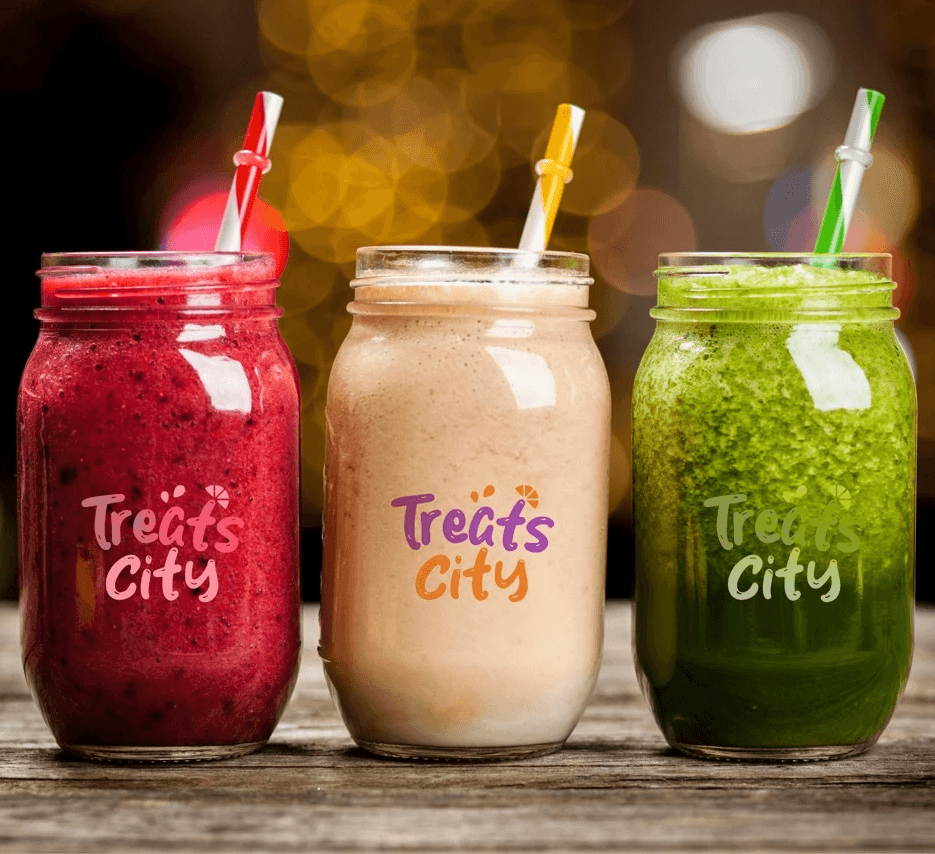
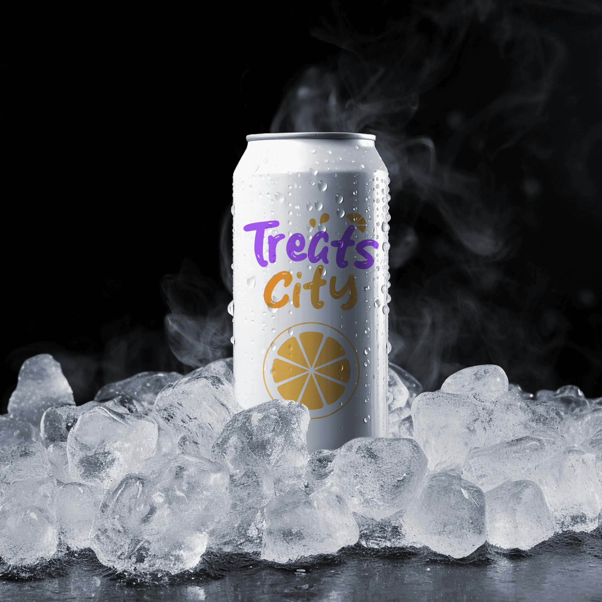
The Playful Logo: 🎨 Explore Treats City through the lens of my redesign. I opted for a word mark logo that mimics the fluidity of liquid, capturing the dynamic essence of the delightful drinks offered. It's not just a logo; it's a visual celebration of the vibrant flavors hidden within each cup.
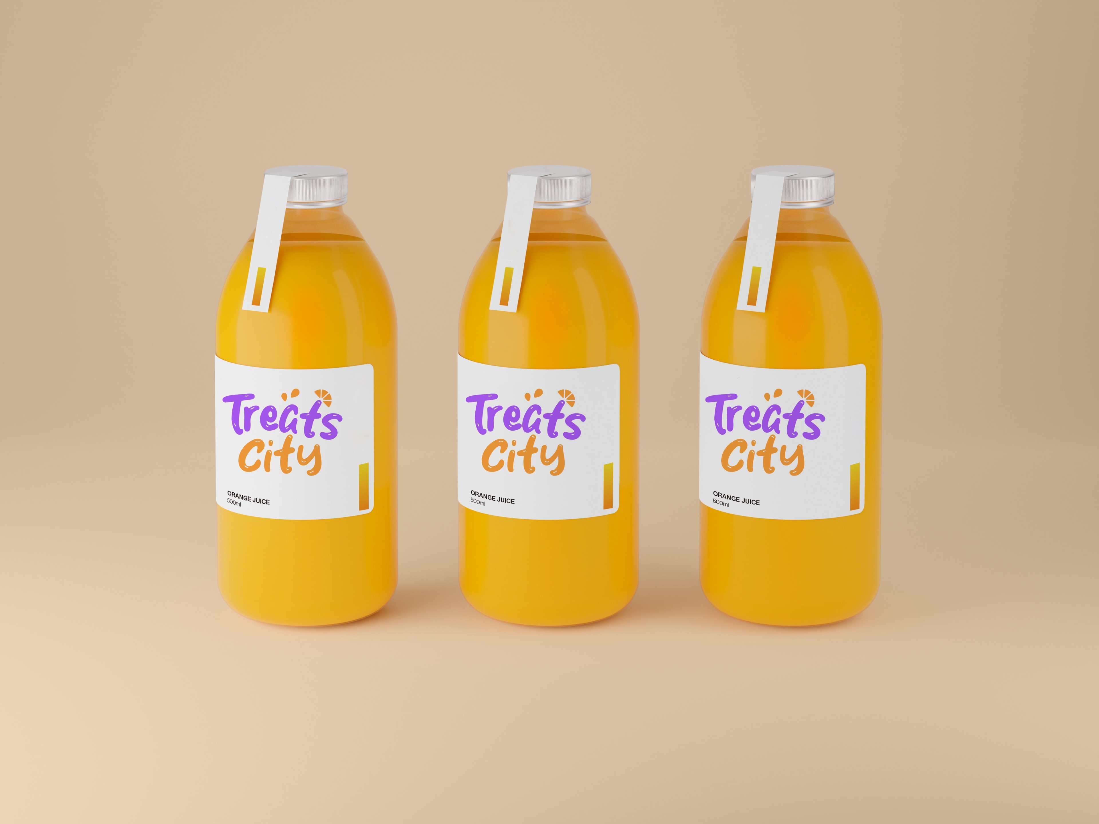

Colors that Speak: 🌈 Immerse yourself in a palette that speaks volumes. Purple and orange were my chosen hues, symbolizing the creative royalty and warm enthusiasm that define Treats City. These colors aren't just eye-catching; they embody the lively energy within every beverage.
A Welcoming Aura: 😄 My design choices were driven by a desire to infuse approachability into Treats City. The redesign exudes friendliness, extending an open invitation for everyone to join in the communal joy of flavorful refreshments. It's a brand that welcomes, resonating with the spirit of conviviality.


Innovative Design Philosophy: 🚀 Beyond aesthetic appeal, the design communicates a commitment to innovation. Treats City stands as a vanguard of pioneering beverages, from refreshing juices to indulgent milkshakes and tantalizing smoothies. The visual identity underscores our dedication to redefining the artistry of the sipping experience.

Conclusion
Welcoming Aesthetic: 😄 My design choices are underpinned by a commitment to infuse a sense of approachability into the brand. The redesigned visual identity exudes friendliness, extending a cordial invitation for patrons to partake in the collective enjoyment of flavorful refreshments. It embodies a brand that not only captivates the senses but fosters a spirit of conviviality. Culmination of Design Excellence: 🌟 In conclusion, Treats City emerges as an experience waiting to unfold, where each sip is a celebration. The meticulous design choices mirror the passion and dedication I invested in this project. Here's to a journey of refinement, celebration, and rediscovery of the joy of sipping with Treats City.
Don't hesitate to say hi, let's talk about your design needs
Next project